In this material, we will tell you how to beautifully design a VKontakte group.
Content
- Images - an important visualization tool for the design of the VKontakte group
- Registration of a hat for public VKontakte
- What avatar should you pay attention to when designing a VKontakte group?
- Widgets: registration of business groups VKontakte
- Video: design of the stylish design of the VKontakte group
Visual perception is one of the most important factors in the formation of a person’s primary opinion of something. Remember: "They meet on clothes ..."? It is very important to remember this principle when you begin to design your business page on the social network VKontakte.
For the first time looking at the page of your community, users will evaluate beauty and convenience, as well as functionality and design professionalism. Therefore, you should not save on the services of specialists, unless, of course, you are a web design guru.
We have prepared for you a series of tips that will help you make your VKontakte group attractive to potential participants and customers.
Images - an important visualization tool for the design of the VKontakte group
“It is better to see once than to hear a hundred times” is another saying that has not lost its relevance in the modern world. Images, which are one of the main visualization tools, occupy their well-deserved place in the profiles of Internet users, so you need to be able to correctly contact them, extracting the maximum benefit.
The quality of the photos also plays an important role, and VKontakte usually has to compress them when loading. It turns out that you can compete with this, and with a very worthy result. To do this, the image must be done twice as much, and the background for a text substrate is as bright as possible (ideally - white) with dark letters.
Where to get good, high -quality sources? The easiest way out is to look for the Internet (you can find free ones, you can buy for money) or create it yourself, then they will be guaranteed to be copyright and original.
VKontakte developers have established the optimal dimensional framework for images that can be loaded into groups in groups. After changing the general design of the social network, new requirements for the pictures appeared, which we will tell you in detail.
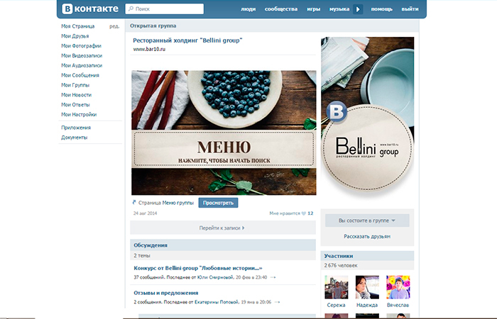
- Avatar: Minimum - 200 x 200 pix., Otherwise, the system will give an error. Decorated maximum - 200 x 500 peaks. (although if the size is larger, the main thing is that the ratio remains 2 to 5).
- Cover: It differs for full and mobile versions, so you need to consider this moment when choosing and checking how it will look when viewing on the phone. So, either 1590 x 400 pix., Or a truncated version - 1196 x 400 pixies.
- Pictures for attachment: Now the news feed of VKontakte is recorded in width, so now your pictures will not be deformed as a result of attachment. Try to ensure that the image is square (very good for the mobile version) or rectangular horizontally and had a width of at least 510 pixies.
- Illustrations for posts with links: join the inscriptions when adding links to it. The minimum for it is 537 x 240 peaks. (but more are allowed and under the proportions). These pictures are taken either by default from Open Graph, or from the Title metatheg, but the user has the opportunity to change them to their taste (choose another photo from the publication for the announcement or place their own).
- Illustrations to the text: 510 x 286 pix. Free advice: make pictures in the editor darker and not motley so that the letters do not be lost against the background.
- Visualization of history: We remind you that only promoted groups that receive special permission from the developers of the social network can publish stories on their own behalf (using the official service). They are illustrated by photographs (1080 x 1920 pix.) And video files (720 x 1280 pix.) - in a vertical format. In addition, the video should meet a number of criterion: the length is no longer than 15 seconds, the size is not more than 5 megabytes, the codec - H.264, voice acting - AAS.
- Cover for the album: for full version-1200 x 800 pix., for truncated-200 units less.
- Video: The optimal size is 1280 x 720 pix.
- Vicki-page: Large pictures when publishing will be compressed to a width of 400 pixies, so click on it with the mouse and set 607 x 342 pixes. With the preservation of the proportions-then it will take the entire width of the Vicky-page.
Registration of a hat for public VKontakte
A hat is the most important place in your group, because it is the first to fall into the field of view of visitors. The most important information is published here: relevant news, navigation menu, ads, and so on.
- Cover. It should be very beautiful and attracting attention (1590 x 400 pixes.) - it easily loads from the community settings menu. On the cover, you can fully cover: publish promotions and the most “hot” proposals, surprise visitors with motto or slogan, introduce the name of the group. You can also, on the contrary, do not overload the cover information, leaving only brief general information about the public and a link for a quick transition to the site.
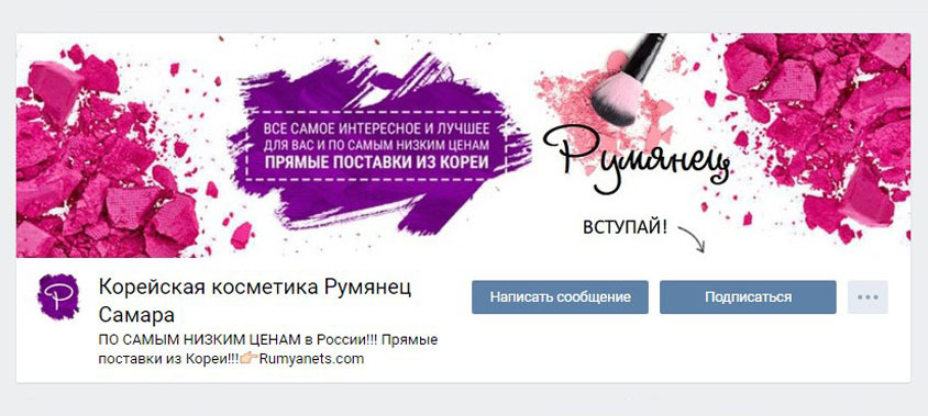
- Consider as an option to use dynamic cover, on which the most valuable changes or events for you or your subscribers can be displayed.
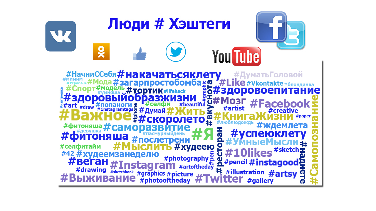
- Hagestegs - they are also sometimes added to the description of the community on the cover in order to increase the relevance of the public and raise it to the highest search steps.
- You can also hang here and fix it vicki-Post Or an article prepared in the editor with a draft image on the announcement - in them you can give detailed information about your group.
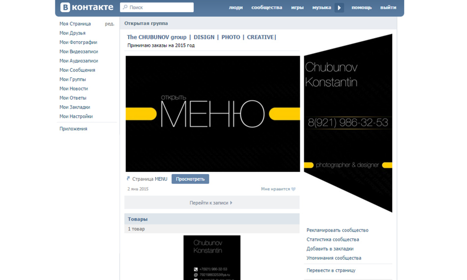
Menu. Here you can also choose from various options exactly the one that will be impressed with you and your subscribers:
- The open version is completely visible in the header of the page.
- Closed-displays only the designation "menu" or "navigation", and access to it can be obtained by opening the wiki post;
- Assigned - avatar and the announcement of the menu are combined into a single array;
- Hidden - it can be made only for public (sections can be read only after the transition to the link).
- Video clip on the machine. You can attach a video file to the group’s hat, which on the machine will sound silently at the entrance to the page. A very attractive maneuver for new guests.
To use this opportunity, you need to choose a video, pour only through VKontakte without using foreign players, attach it to a messenger and attach it to a hat.
- Mega-popular post. The most popular publication can rightfully take an honorable place in the group’s header, because a large number of likes, views and reposts are a guarantee of increasing the number of your subscribers.
- Announcements, presentations, promotions, draws. It is in the hat that you can stir ads that announce various events or albums for your subscribers - here they will see the maximum number of users.
- Subscriber reviews, cases. Feedback, all the more effective - what could be better for confirming the reputation and further promotion of the group? Take these moments in a hat, and the reaction will not be long in coming.
- Application advertising. If you are already so promoted community that you have acquired a mobile application, then this is a good reason to inform your subscribers and new visitors about it.
- Rules. It is nice to place information about the rules of the community in his hat - this will also increase your rating (after all, discipline has always been among the positive features) and simplify the process of their search for those who want to join the group.
- Links. In the cap, you can post links to other communities (for example, your partners) or social networks - this is already decided.
What avatar should you pay attention to when designing a VKontakte group?
An avatar is a stylized marketing tool designed to attract the attention of the target audience and encourage certain actions. Therefore, the creation of a competent logo consisting of several elements will need to work hard.
- Miniature Avatar. The font of its text should be large enough to read, but not exceed its limits. The image on the avatar should be understandable and recognizable, original and quite bright and standing out against the general background, and also - stylish and thought out to every little thing.
- In the small space of miniatures, you can place important information, for example: the announcement of something (services, events, goods), the advantages of the public, contacts for communication, favorable moments of cooperation (the best prices, delivery conditions, expert assistance, and so on), all kinds of competitions, all kinds of competitions, all kinds of contests vacancies. In a word, a very good platform for creativity.
- When the cover is not set in the public, users will see full version of the avatar. If this is your case, then the avatar should be of high quality.
- To make the community hat look stylish and attractive, you need to create an avatar in one vein (color scheme, font, manner of design) from the menu.
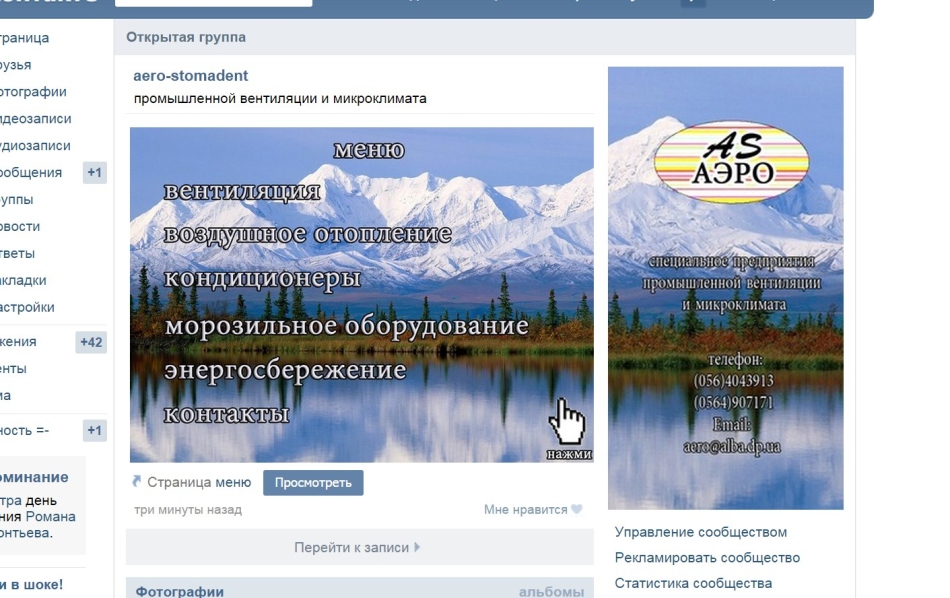
Attention: the avatar and its miniature can be the same, or may differ - you decide. The main thing is not to overload it with excessive information, let its space be “airy”.
- Information on the avatar. It can be any position that are most important to you and your visitors: the domain of the site, contacts and operating mode, small advertising of goods, promotions and discounts, a message about the availability of a mobile application, links to other social networks, listing your awards and achievements, and so on.
- Awatar and menu They are created using any graphic editor within its capabilities.
If you do not know how to use a standard photoshop, then there are special services with ready -made options, for example, Fotor.com, canva.com And the like. It is absolutely easy to cope with them.
Widgets: registration of business groups VKontakte
When applying for a business group, one must not forget about the use of widgets, thanks to which you can carry out feedback: share the reviews of participants, apply for applications, subscribe to the newsletter, accept gifts, participate in competitions and draws, and so on.
Creating templates for posts
If you want the posts on the page to look stylish and recognizable, then you can develop (yourself or with the help of a designer) special templates for the announcements in which you will only need to change the color of the picture and fill the new text.
For this you can:
- play with the lightening of the image to facilitate the perception of the text
- create a contrasting area and write on it
- highlight text lines with color
- divide the image into two halves; Make a muddy picture
- initially, choose a photo with a place for credits
- add special effects to fonts (shadows, strokes, glow and the like)
Sometimes a logo is added to the template - a brand, if your group already has it.
Editor of articles
In VKontakte, there is a text editor for layout - the entrance to it is marked by the large letter “T” in the upper right corner of the screen. Even a novice user can use his services.

Vicky-dump
Vicky damping is a conductor for the HTML language, is an alternative option for the usual text. It is effective when creating large materials with various text secretions, adding graphics, audio, video effects, a bright navigation menu.

For work, I recommend that you master the “Starting Page Code” service, which makes it possible to view the wiki page code (enter the service, insert a link to the desired type of group and view, find the desired page in the registry and click on the phrase “View code”).
Editor and wiki community
VKontakte has a editor for processing Vika-page, as well as special groups “Vicky VKontakte” and “Vicky Doc”.
To create such a page, you need to insert the next set of characters into the address line: http://vk.com/pages?id\u003d-xxx&p\u003d ONLY OF THE PORNICH, where xxx - This is the ID of your page (you can find either in the “community records” - the numbers to “?”, Or using the “Find out ID) service, and the“ Table of Contents ” - this is the heading of the material with lower emphasis on the places of spaces.

- You can configure the possibility of editing materials yourself (you will find the settings for this on the left at the bottom of the editor). It is necessary to very carefully allow editing your materials to outsiders.
- To go to the code mode when working with a visual editor and vice versa, you just need to click on the icon with two horizontal triangular brackets in the upper right corner of the editor.
- It is easy to handle the editor - by analogy with Word, it is only impossible to play with the font size, but to engage in taging (H1, H2, H3), italic or fat discharge. For more serious formatting of the text, you need to do in the code mode manually.
- To insert links to the material in the wiki damping, you need to prescribe the formula: [link to the material | text of the link].
- It is recommended to unload pictures in coded mode to avoid automatic leveling and compression. And before filling the video file, you must first save it in your videos.
To hang a link to the picture, put in the encoding mode after the second icon | link to the desired file, align and write down the size.
Create a navigation menu
If you do not plan to create a complex menu, it is enough to simply portray all navigation points in the editor.
- It will be necessary to work with something like Photoshop in which you should create a picture, cut it into pieces, pour pieces in a wiki post with the addition of links.
- You can fix the created menu on the page of the page, creating it in a wiki language.
- The menu can be very diverse: simple (1, 2 or several columns), in tabular layout (creating a table on wiki linguistics), adaptive.

So that they look good both on the screen of a personal computer and in a mobile gadget, we advise using a table layout with a clear width of the cells and cut the menu on the same geometric shapes (3 columns - maximum width - 190 pix., 4 columns - 150, 5 - 110) .
Checking the result
During the layout in the wiki damping, it is advisable to control the result visible by users from various devices. There are special applications that simplify this task.
In the Google Chrome browser, just go to the wiki page and put "m." To the address, then click on the right mouse and select "see the code", and then - on the stylized drawing of a mobile gadget. You should choose the device you are interested in and update the page so that everything is displayed correctly.
You can also install the Resolution Test plugin on Google Chrome, go to the mobile version of VKontakte and choose the size of interest.


